Color of the year
It’s only fitting that we start the new year with a blog post about the «Color of the Year 2019». It is an annual announcement from the U.S. based Pantone Color Institute, best known for its color matching system, enabling color-sensitive decisions for designers and manufacturers in the graphic, fashion and product design industry. Every December the color experts at Pantone release a shade that they believe will set the tone for the year ahead. It also wipes the previous year’s color slate clean and refreshes the design world. Last year’s color was Ultra Violet, a color intense and dramatic so in comparison this year’s color, Living Coral is much calmer, mellower, yet vibrant at the same time.

It’s a peachy orange, a warm color that in synergy with cool toned, “watery“ colors suggests an image of a tropical island and its colorful sea life.

Pantone UNDER THE SEA color combination

Pantone SYMPATICO color combination
On the other hand, pairing it with skin tones makes it bold and brilliant, just like the make up that creates a healthy glow on our faces.
Living Coral paired with bold and «wild» colors makes for an almost dizzying effect, that can be pulled off only by the exuberant, fun and spontaneous. It’s a life-affirming combination!

Pantone TRIPPY color combination

Pantone SHIMMERING SUNSET color combination
Pantone’s suggested sunset color harmony portrays color splashes of the sunrise and sunset. It also consists of bold and lively colors, but because it plays with different shades within just two color families, it never feels like chaotic or too much. It feels like cozy warmth.
Living Coral among muted and/or secondary colors stands out as the color combination’s name suggest, like a FOCAL POINT. It becomes vivid and the «cherry on top» of this color grouping. It’s understated but not loud, and composed without being boring.
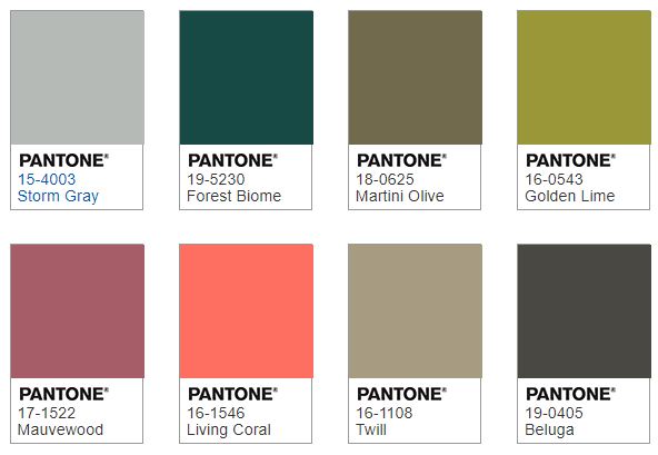
Pantone FOCAL POINT color combination
In conclusion, LIVING CORAL can compliment other colors or uplift them, it can be harmonious to other colors or stand out and vivify them. It all depends on what colors you choose to pair it with but I think the best part about it is that in whatever combination you like this color it will draw the eye and wake up the mind. It’’ll make you feel «alive».
Thank you for checking in for the first blog post in 2019! Hope to see you soon, again.
Your very own fairy,
Tünde- Nefeli


